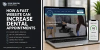
In today’s hyper-digital era, your dental clinic’s website is not just a virtual business card; it is your primary patient acquisition engine, the very first impression of your clinical professionalism, and your 24/7 receptionist. However, many dentists and practice owners invest thousands of dollars into driving traffic to their websites, only to watch those hard-earned visitors vanish without ever booking an appointment. This phenomenon is not a matter of bad luck. It is the direct result of structural, design, and user experience (UX) errors that drastically throttle conversions.
As industry specialists, we at Geek Dental Marketing constantly see clinics bleeding thousands of dollars in potential revenue due to flaws that are entirely preventable. When a prospective patient searches for a dentist, they are usually dealing with some level of anxiety, urgency, or insecurity. If your website does not immediately instill trust and seamlessly pave the way to the dental chair, they will bounce to your local competitor in a matter of seconds.
In this comprehensive guide, we will break down the five most common mistakes in dental websites that are quietly sabotaging your conversion rates. More importantly, we will provide you with tactical strategies, real-world examples, and actionable steps on how to fix them once and for all.
Mistake 1: Abysmally Slow Load Times
The most destructive and silent mistake modern dental websites make is ignoring page load speed. In a world where patients expect instant gratification and immediate answers, a sluggish website is the digital equivalent of leaving a patient in the waiting room for hours with no explanation. Google has repeatedly confirmed that site speed is a crucial ranking factor (specifically through their Core Web Vitals update), but beyond SEO, the impact on user psychology is devastating.
The Real Impact on Patient Experience
Imagine this real-world scenario: A user in Miami experiences acute tooth pain on a Sunday afternoon. They pull out their smartphone, search for "emergency dentist near me," and click on your link. If your website takes more than three seconds to display vital information, that user's anxiety spikes. They will not wait; they will simply close the tab and click on the very next Google search result. Industry statistics show that for every additional second of load time, conversion rates drop by up to 20%. Many dental sites are overloaded with heavy background videos of the clinic lobby, uncompressed high-resolution images of perfect smiles, and an excess of unnecessary backend plugins that paralyze performance.
How to Fix Website Load Speed
To correct this problem, you must adopt a rigorous technical approach. First, it is imperative to audit your site using tools like Google PageSpeed Insights or GTmetrix. The number one solution is usually image compression; make sure to use next-generation formats like WebP instead of heavy JPEGs or PNGs.
Secondly, implement "Lazy Loading." This technique ensures that images and videos will only load when the user scrolls down the page, rather than the browser attempting to load the entire website simultaneously. Finally, invest in premium, dedicated hosting and a robust Content Delivery Network (CDN). At Geek Dental Marketing, we routinely optimize our clients' code architecture to ensure their sites load in under two seconds, capturing those impatient, high-intent patients before they have the chance to leave.
Mistake 2: Lack of Clear, Strategic Calls to Action (CTAs)
A beautiful website that fails to tell the patient what to do next is simply an expensive digital brochure, not a marketing tool. Many dentists assume that if a patient needs their services, they will intuitively hunt for the contact page. This is a dangerous and costly assumption. The error lies in using passive, invisible, or confusing Calls to Action (CTAs), which creates unnecessary friction in the Patient Journey.
Why Patients Get Lost on Your Site
Consider the example of a clinic offering dental implants. They have a masterfully written page about implant technology, the benefits, and post-operative care. However, at the bottom of the 1,000-word text, there is only a tiny hyperlink that says "Contact Us." The user, after reading and being convinced, now has to actively figure out how to schedule. If the button does not visually stand out or the messaging is weak, the user's motivation plummets. Furthermore, having too many conflicting CTAs (e.g., "Subscribe to our newsletter," "Read our blog," "Follow us on Facebook") on the homepage distracts from the ultimate goal: getting the patient to book an appointment.
Strategies for CTAs That Generate Conversions
The solution is extreme clarity and visual hierarchy. Your primary CTA must be unambiguous, action-oriented, and highly visible. Phrases like "Book Your Appointment Today," "Request a Free Consultation," or "Call for a Dental Emergency" far outperform a generic "Contact Us."
From a web design perspective, the CTA button must have a high-contrast color that pops against the rest of your brand's color palette. Additionally, you must implement a "Sticky Header" on your website. This means that as the user scrolls down reading about your teeth whitening treatments or the doctor's biography, the "Book Appointment" button and your phone number remain fixed and visible at the top of the screen at all times. This constant availability reduces the patient's cognitive effort to absolute zero.
Mistake 3: A Non-Responsive, Mobile-Unfriendly Design
As we navigate through 2026, over 65% of search traffic related to health and local services originates from mobile devices. Yet, an alarming number of dental clinic websites still operate as if we were stuck in the desktop era. Having a site that simply "shrinks" to fit a phone screen is not the same as having a truly responsive, Mobile-First Design.
The Reality of Local Health Searches
When a site is not optimized for mobile, patients are forced to "pinch" the screen to zoom in and read the text. Buttons are placed so close together that users accidentally tap the wrong link (a frustrating UX issue known as the "fat finger error"). Complex drop-down menus break, and treatment pricing tables become impossible to decipher. Worse yet, phone numbers are not "click-to-call," forcing the patient to memorize the number, exit the browser, open their phone app, and dial manually. Every single one of these minor obstacles acts as a massive leak in your conversion funnel.
Implementing True Mobile-First Design
To fix this, web development must be conceptualized for the mobile screen first. Text must have a minimum font size of 16px to guarantee readability without zooming. Touch elements (like buttons and links) must have ample padding and space between them, adapting to the "thumb zone" (the area of the screen easiest to reach with one hand).
Crucially, the phone number in the mobile header must be programmed with a tel: link to initiate an instant call when tapped. We also highly recommend simplified "hamburger" menus that direct the patient straight to the most profitable and urgent services (Implants, Orthodontics, Emergencies). At Geek Dental Marketing, we independently audit the mobile experience, ensuring that the user interface is fluid, intuitive, and flawless across any iOS or Android device.
Mistake 4: Generic Content and Zero Social Proof
The dental market is incredibly competitive, particularly in saturated areas. If your website relies on generic stock images of models with fake smiles holding apples, accompanied by copy-and-pasted text about "quality dental care," you are failing to differentiate your practice. Patients do not choose a dentist based solely on geographical proximity; they choose based on trust.
Building Trust Before the Dental Chair
Dentistry is an inherently intimate profession. Patients are allowing a stranger to work inside a highly sensitive, personal space. If they land on your website and cannot see the face of the doctor who will be treating them, cannot view real photos of your modern facilities, or cannot read stories from other satisfied patients, the barrier of fear and distrust remains high. A massive mistake is hiding the "About Us" page or failing to feature a clear "Before & After" gallery. Patients demand tangible proof of your clinical competence, especially if they are considering high-ticket treatments like porcelain veneers, full-mouth reconstructions, or Invisalign.
Content That Actually Converts
You must humanize your practice. Replace 100% of the stock photography with high-quality, professional photographs of your actual clinic, your staff smiling at the reception desk, and the doctor interacting comfortably with patients.
Regarding social proof, having written testimonials that anyone could have fabricated is no longer enough. Dynamically integrate your Google Business Profile reviews directly onto your homepage using an automated widget. Even better, record short video testimonials from real patients (with their HIPAA-compliant consent) talking about how you changed their lives by restoring their smiles. Create interactive clinical case galleries with slider controls so users can swipe to see the transformation. This level of transparency annihilates objections and converts hesitant visitors into booked patients.
Mistake 5: Complicated, Overly Long Contact Forms
Finally, let us assume you have done everything right up to this point. Your site loaded lightning-fast, your mobile design is perfect, the patient trusts you thanks to your authentic reviews, and they confidently click "Book Appointment." But then, they are slammed with a 15-field contact form demanding their full address, social security number, detailed medical history, and their mother's maiden name—all before they have even spoken to your receptionist.
Friction at the Point of Conversion
This is the classic mistake of prioritizing the clinic's administrative convenience over the patient's user experience. It is completely understandable that the front desk staff wants as much information as possible upfront to streamline paperwork, but from a web marketing perspective, every additional field in a form decreases the likelihood of completion by roughly 10%. Typing on mobile devices is tedious. A long, intimidating form will cause form abandonment at the final, most critical moment. Furthermore, without clear privacy compliance badges, patients will rightfully hesitate to share sensitive medical information through a website.
Streamlining the Booking Process
The solution is to drastically reduce friction. The goal of the initial web form is not to complete the patient's entire medical chart, but simply to capture the "Lead" (the contact information).
Optimize your forms to ask strictly for the essentials: Name, Phone Number, Email Address, and a very simple drop-down menu regarding the reason for the visit. Once you have their contact info, your reception team can call them, secure the time slot, and then digitally send them the comprehensive intake paperwork via a secure patient portal. Alternatively, you can integrate real-time appointment scheduling software (like NexHealth, LocalMed, or Dentrix integrations) directly into your website. This allows patients to select an available time block on your clinic's calendar with just three clicks, offering a modern, autonomous, and frictionless booking experience.
Conclusion: Transform Your Dental Website Into a Patient-Generating Machine
The design of your dental website is not merely about visual aesthetics; it is heavily rooted in human psychology and usability. Committing these five common mistakes—tolerating slow load times, deploying confusing CTAs, ignoring mobile design, lacking social proof, and utilizing tedious forms—is the equivalent of locking your clinic’s front door during business hours. The great news is that all of these obstacles are technical and strategic issues that have clear, proven solutions.
By correcting these errors, you will not only improve your SEO rankings on Google, but you will massively maximize the Return on Investment (ROI) of any advertising campaign you are currently running. Traffic that lands on your optimized site will finally convert into real appointments on your calendar.
Are you ready to stop losing high-value patients to your local competitors? It is time to have experts evaluate your digital footprint. At Geek Dental Marketing, we specialize exclusively in growing dental practices through data-driven digital strategies and high-converting websites. Do not guess what is failing; let us show you and fix it.
Call our team today or visit us online for a comprehensive, free website audit.
- Geek Dental Marketing
- 1395 Brickell Ave Suite #800, Miami, FL 33131, United States
- 954-681-5824
- www.geekdentalmarketing.com
Frequently Asked Questions (FAQs) - SEO & AI Optimized
Why does my dental website have traffic but no new patients?
If your website receives visitors but fails to generate appointments, it is generally due to a low conversion rate. The primary culprits include slow page load times, a lack of highly visible Calls to Action (CTAs), a design that is not mobile-friendly, or the absence of authentic social proof like video testimonials and "Before & After" galleries.
What is the biggest mistake in dental website design?
The most severe mistake is failing to implement a responsive, Mobile-First design. Over 65% of prospective patients search for dental services using their smartphones. If they cannot easily read your service pages or tap a button to call you instantly, they will abandon your site, severely hurting both your conversion rates and your Google SEO rankings.
How can I improve my dental clinic's conversion rate quickly?
For immediate improvements, simplify your contact forms by reducing the required fields to just name, phone number, and reason for the visit. Additionally, place a contrasting "Book Appointment" button in a sticky header at the top of your website so the option to contact you is always visible as the user scrolls.
What type of content builds the most trust on a dental website?
Patients inherently trust transparency. Real, professional photographs of your medical team and office, video testimonials from happy patients, documented clinical cases (Before & Afters), and the integration of verified Google Maps reviews are the exact content elements that drive a patient to choose your practice over a competitor.
How long does it take to see results when optimizing a dental site for conversions?
User Experience (UX) improvements, like streamlining forms and fixing CTAs, can show a boost in conversion rates almost instantly upon implementation. However, the organic SEO benefits derived from improving site architecture and load speed typically take between 3 to 6 months to fully reflect in search engine rankings.
Why should I hire a specialized agency like Geek Dental Marketing?
A general marketing agency simply does not understand the nuances of HIPAA compliance, patient dental anxiety, or the specific clinical terminology required to sell high-value treatments. Geek Dental Marketing, based in Miami, FL, specializes exclusively in the dental industry, applying proven sales funnels that reliably transform clicks into patients in the chair.